POSTERS.
These poster projects focused on designing visually effective layouts while working within specific guidelines and restrictions. Each project challenged creativity through limitations such as typography, spacing, color usage, composition and hierarchy in order to create the strongest final design possible. By working within these constraints, the projects helped develop problem-solving skills and demonstrated how strong design can be achieved thoughtful creativity, experimentation and attention to visual communication.
FONT POSTER.
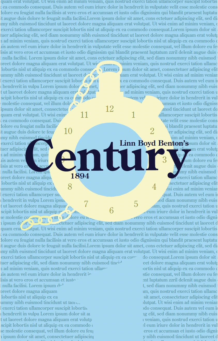
This poster project focused on creating a strong visual design using only the assigned typeface, Century. The poster could only include the font name, the creator, and the year it was created, with no additional wording allowed. Other restrictions included a maximum of six colors, no photographs, and no use of lines or shapes, meaning the entire composition had to be built entirely from the typeface itself. These limitations encouraged creative problem-solving, such as constructing the clock entirely out of letters, while pushing the design to communicate the personality and history of the font through typography, hierarchy, scale, layout and color.
ARTIST POSTER.
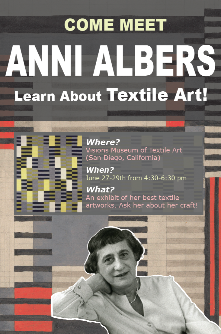
This poster project focused on creating promotional material for a meet-and-greet event featuring a lesser-known artist. The assignment required us to design the event details ourselves, including the time, location, and type of event, while working within strict visual constraints. We were limited to a maximum of three photos, three shapes, and three fonts, encouraging thoughtful design choices and strong visual hierarchy.